
We know home theater - 26th Anniversary
Questions? CALL TOLL FREE 1-888-764-9273


Before a movie could become a hit, it first had to attract an audience. For more than a century, the movie poster has been one of the film industry's most important tools for accomplishing that task. A successful poster had only a few seconds to stop a passerby, communicate the genre, identify the stars and make the film appear impossible to miss.
Posters were created as advertising, not as permanent works of art. They were shipped to theaters, displayed outside or in the lobby, replaced when the engagement ended and often returned, reused or destroyed. That temporary purpose is one reason original posters and lobby cards later became desirable collectibles. The objects that survived preserve not only the image of a film, but also the way theaters sold it to its first audience.
Movie posters developed from a much older tradition of advertising plays, circuses, vaudeville acts, magic shows and touring performers. Nineteenth-century improvements in lithography made it possible to reproduce colorful illustrations and large lettering in quantities suitable for public display.
Lithography worked by drawing or transferring an image onto a flat printing surface, traditionally stone and later metal plates. Separate stones or plates could be used for different colors. The process was labor-intensive, but it produced vivid images that could be seen across a street or from the entrance of a theater.
These early advertising posters established principles that movie campaigns still use: one dominant image, a recognizable star or spectacle, bold lettering and enough visual drama to create curiosity before the audience knew the full story.
In the 1890s, motion pictures themselves were the attraction. Posters often advertised the projection technology, the novelty of moving images or the experience of watching a picture on a large screen rather than promoting a feature-length narrative.
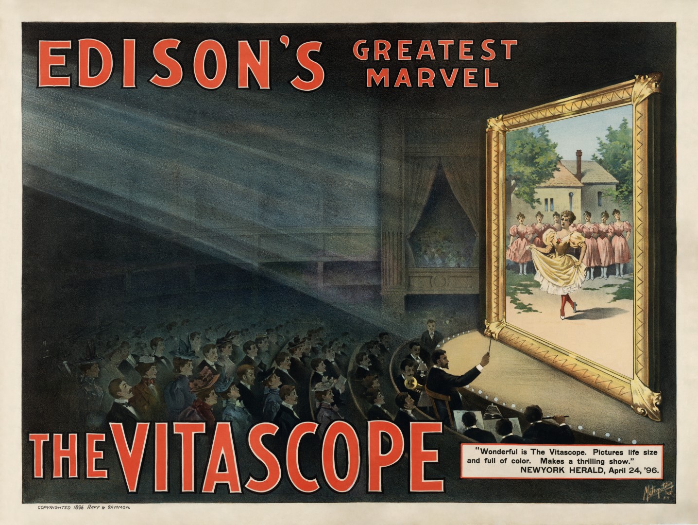
The Vitascope poster shows how early film advertising borrowed the visual language of theater. The audience, musicians, boxes and projected dancers communicate that the new machine would create a complete public spectacle. The technology itself was as important to sell as the subject appearing on the screen.
As films became longer and developed recurring stars, characters and stories, advertising shifted. Posters began to promote the title, actors, romance, comedy, adventure or danger contained in a specific production.
By the silent-feature era, a poster had to summarize a film without revealing too much. Designers might emphasize the star's face, an action scene, an emotional confrontation or a romantic pairing. The image did not need to reproduce an exact frame from the film. Its job was to create a persuasive promise.
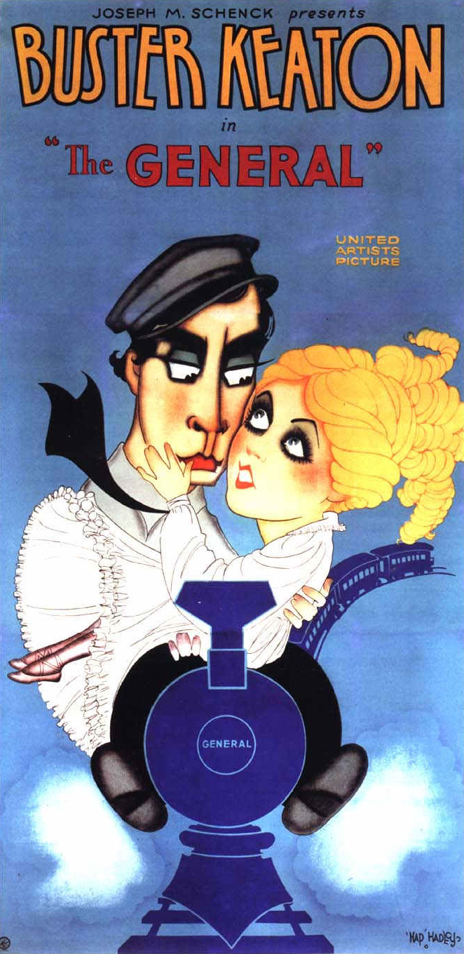
The poster for The General is a strong example of hand-drawn commercial illustration. It combines portraiture, action, lettering and color hierarchy. Buster Keaton is immediately recognizable, while the train and soldiers establish scale and genre. The composition sells comedy and adventure without depending on a photographic still.
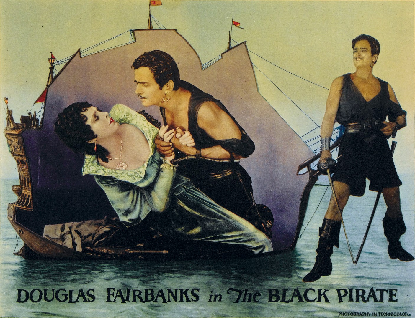
A theater campaign extended well beyond one poster. Depending on the period, a theater might receive one-sheets, larger multi-sheet posters, window cards, lobby cards, still photographs, banners and pressbooks. The marquee announced the title and stars, while the artwork supplied the emotion and spectacle.
Posters appeared in exterior display cases, near the box office, in storefront windows and throughout the lobby. Lobby cards were designed to be viewed at close range. The Library of Congress notes that 11-by-14 inches became the standard lobby-card size and that sets commonly included a title card and seven scene cards.
The theater manager was also expected to be a local promoter. Pressbooks—sometimes called showmanship manuals—provided plot descriptions, cast information, ready-made newspaper advertisements, publicity stories, poster-order information and ideas for contests or promotional tie-ins. A manager could insert the theater name and showtimes into prepared advertising while adding local promotions suited to the community.
This system allowed studios to control the central image and message while giving exhibitors tools to generate local excitement. Promotion could include decorated lobbies, costume displays, partnerships with stores, special appearances, radio mentions, newspaper contests or street-level stunts.
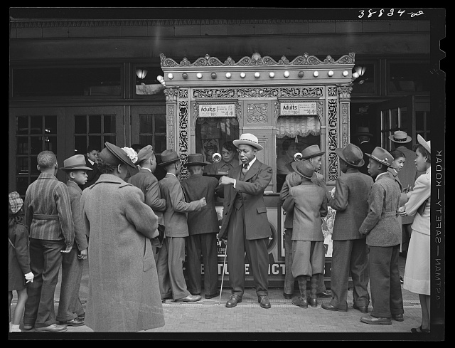
Not every poster was a standardized studio print. From the 1910s into the 1950s, theaters and theater chains employed artists to create unique hand-painted displays for local use. These artists could enlarge a portrait, emphasize a romantic angle, make an action scene more dramatic or tailor the campaign to what a particular neighborhood audience might find appealing.
The Academy's Poster Painters Collection documents this once-common cottage industry. Many artists remained uncredited because their work was considered temporary commercial decoration. Posters were sometimes painted over and reused after a film ended, which explains why relatively few survived.
Batiste Madalena became one of the best-known rediscovered theater poster painters. George Eastman hired him to create posters for the Eastman Theatre in Rochester, New York. MoMA records that Madalena produced more than 1,400 unique works between 1924 and 1928, sometimes completing as many as eight new posters per week. Roughly 250 survived after he rescued them from disposal.
As Hollywood distribution expanded, National Screen Service became a major supplier of posters, lobby cards, stills and other advertising materials to theaters. From the 1940s through the 1980s, it supplied multiple poster sizes and designs for studio releases.
National Screen Service markings and numbers can help collectors identify the release year and campaign associated with a poster, although markings alone do not prove authenticity. Reissues, later printings, international versions and reproductions may use similar images.
The materials were working inventory. Theaters were often instructed to return them for later engagements or destroy them when they were no longer needed. Posters could be folded for shipment, pinned to walls, pasted to boards, exposed to sunlight or written on by theater employees. The wear found on surviving originals is evidence of how they were used.
The production process varied by studio, artist, era and budget, but a traditional campaign often began with an advertising concept rather than a finished illustration. Publicity executives decided what should sell the film: a star, a romance, a monster, a spectacle, a mystery or a memorable symbol.
Artists and designers produced small preliminary layouts commonly called sketches or comps. These explored the placement of the title, star names, portraits, action and credit information. The studio might request several approaches before approving one direction.
The final art could be painted in gouache, tempera, watercolor, oils, pastel, colored pencil or airbrush, often on illustration board. Some artists combined painted portraits with photographs, hand lettering or separately prepared title treatments. The original artwork was usually larger and more detailed than the printed poster.
The printer then converted the design into a reproducible form. Early posters relied heavily on lithography. Later campaigns used photolithography and offset printing, which could integrate photographs and type more efficiently. Color separations translated the artwork into individual printing colors, and the final sheets were trimmed, folded when required and distributed to theaters.
Digital tools eventually replaced much of the mechanical paste-up, hand separation and airbrush work. Modern key art may combine digital photography, illustration, typography and computer compositing. The distribution may be digital, but the central design problem remains the same: reduce an entire film to one memorable visual idea.
Many early film posters did not prominently credit the illustrator. The studio, printer and stars mattered more commercially than the artist's name. Over time, however, collectors, museums and historians began identifying the designers whose work gave particular films a lasting visual identity.
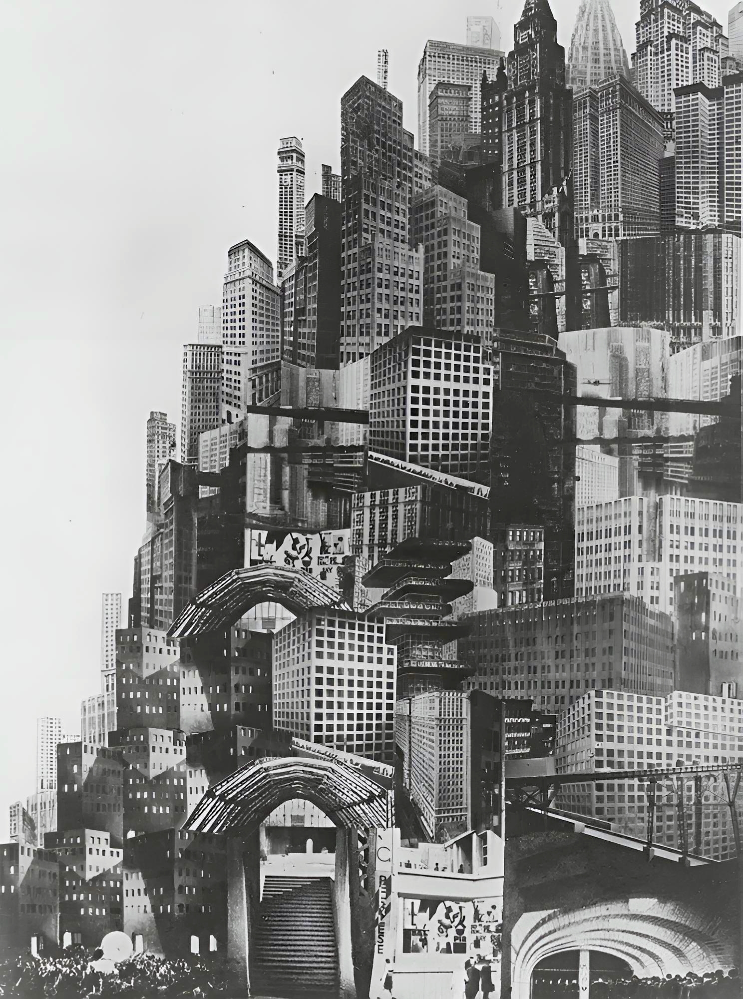
Boris Bilinsky's European poster for Fritz Lang's Metropolis demonstrates how a poster could interpret a film rather than merely illustrate its stars. The geometric city, machinery and monumental figure transform the film's themes into a bold Art Deco composition.
Saul Bass brought modernist graphic design to film advertising and title sequences. The Academy describes his stark minimalism as highly influential. Instead of relying on realistic star portraits, Bass could reduce a film to a fractured body, a hand, a spiral or another forceful symbol.
His campaigns for films including The Man with the Golden Arm, Anatomy of a Murder and several Alfred Hitchcock productions demonstrated that a simplified graphic idea could become more recognizable than a montage of actors. The poster, advertising campaign and opening title sequence could share one unified visual language.
Bob Peak brought the sophistication of editorial and advertising illustration into major film campaigns. His work frequently used expressive portraiture, montage, unusual color and dramatic brushwork. Posters associated with his career include Apocalypse Now and other large-scale studio releases.
Peak's approach helped establish the richly painted ensemble poster as a dominant form of late-twentieth-century movie advertising. Multiple stars, locations and story elements could be blended into one image without looking like a simple photographic collage.
Richard Amsel combined highly finished portrait drawing with elegant composition and period detail. His poster work included The Sting, Flash Gordon and multiple campaigns for Raiders of the Lost Ark. The Academy's Richard Amsel papers preserve drawings, paintings, posters and preliminary artwork, demonstrating how many stages could precede the final printed image.
Drew Struzan became one of the most recognizable movie-poster illustrators of the modern era. The Smithsonian notes that he created more than 150 film posters. His painted campaigns are associated with the Star Wars, Indiana Jones, Back to the Future and Muppet films, among many others.
Struzan's method combined accurate likenesses, cinematic lighting, supporting characters and story details into a unified composition. His posters could suggest the scope of an adventure while preserving the warmth and individuality of hand-rendered artwork.
The Smithsonian observes that early movie posters emphasized original artwork with bright colors and bold lettering, while photographic imagery became increasingly common beginning in the 1950s. By the later twentieth century, photography dominated many campaigns.
Photography offered obvious commercial advantages. Audiences could immediately recognize the stars, and studios could reuse publicity portraits and production stills. Airbrushing, retouching and compositing allowed designers to combine faces, settings and effects before digital software made the process faster.
Illustrated posters did not disappear, but they became more selective. Fantasy, adventure, science fiction and prestige releases continued to commission painted art, while minimalist graphic design also remained effective when a campaign had one unusually strong symbol.
A single film could receive very different posters in the United States, Europe, Japan, Australia and other markets. Local distributors translated titles, changed star emphasis and commissioned artwork suited to regional design traditions or audience expectations.
International formats also differed. Australian daybills used a tall, narrow shape that created a different composition from the American one-sheet. British quads emphasized a horizontal format. Italian, French, Polish and Japanese posters could reinterpret the same film with artwork that looked entirely unrelated to the American campaign.
These variations became a major part of collecting because they allow one movie to be viewed through multiple graphic traditions. A collector may prefer the poster from the film's country of origin, the first-release American one-sheet, an unusual foreign design or the version created by a favorite artist.
Movie-poster terminology can be confusing because the format names developed from national printing and theater-distribution systems. A U.S. one-sheet, British quad, Australian daybill and Italian two-foglio were all legitimate theatrical posters, but they differed substantially in size, orientation and visual composition.
Dimensions should be treated as customary rather than absolute. Sizes changed over time, and individual posters can vary slightly because of printing, trimming, folding, restoration or regional production. An actual poster should always be measured before a frame is ordered.
One-Sheet: approximately 27 by 41 inches on older releases and generally 27 by 40 inches from the mid-1980s forward. This vertical format became the best-known American theatrical poster.
Half-Sheet: approximately 22 by 28 inches and normally horizontal. It provided a compact alternative for lobby and window displays.
Insert: approximately 14 by 36 inches. Its tall, narrow shape often required artwork different from the one-sheet.
Window Card: approximately 14 by 22 inches, traditionally with blank space where a theater could add its name and show information.
Lobby Card: 11 by 14 inches, normally issued in sets showing several scenes and a title card.
Three-Sheet: approximately 41 by 81 inches and commonly assembled from more than one printed section.
Six-Sheet: approximately 81 by 81 inches. Its large scale was intended for major exterior or lobby displays and generally required multiple sections.
British Quad: 30 by 40 inches and normally horizontal. The landscape format frequently required an entirely different composition from the vertical American one-sheet.
British Double Crown: approximately 20 by 30 inches, usually vertical and smaller than the quad.
Australian Daybill: usually about 13 by 30 inches in the postwar era. Earlier long daybills could approach 14 by 40 inches, and other sizes appeared during different periods.
The daybill's unusually tall and narrow shape is one reason Australian versions are attractive to collectors. Designers had to rearrange portraits, titles and action to fit a format very different from the American one-sheet.
Locandina: approximately 13 by 28 inches. Many examples included blank space where theaters could write local engagement information.
Fotobusta: commonly about 19 by 27 inches on later releases, although earlier examples appeared in smaller sizes. Fotobustas were frequently issued in sets with different scenes.
Un Foglio or One-Foglio: approximately 28 by 39 inches, serving a role similar to the American one-sheet.
Due Fogli or Two-Foglio: approximately 39 by 55 inches. This large vertical format offered artists a dramatic field for painted artwork.
Quattro Fogli or Four-Foglio: approximately 55 by 78 inches and usually printed in two overlapping sections. Italian four-fogli are known for their large scale and elaborate illustration.
French Petite: approximately 16 by 24 inches, or 40 by 60 centimeters.
French Moyenne: approximately 24 by 32 inches, or 60 by 80 centimeters.
French Grande: approximately 47 by 63 inches, or 120 by 160 centimeters. Its scale allowed for bold illustrated compositions.
German A1: approximately 23 by 33 inches, based on the international A-series paper system.
Japanese B2: approximately 20 by 29 inches and the most familiar full-size Japanese theatrical format.
Japanese Chirashi: a small handbill, commonly about 7 by 10 inches and often printed on both sides for distribution in theater lobbies.
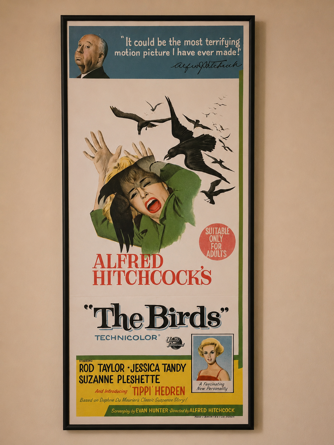
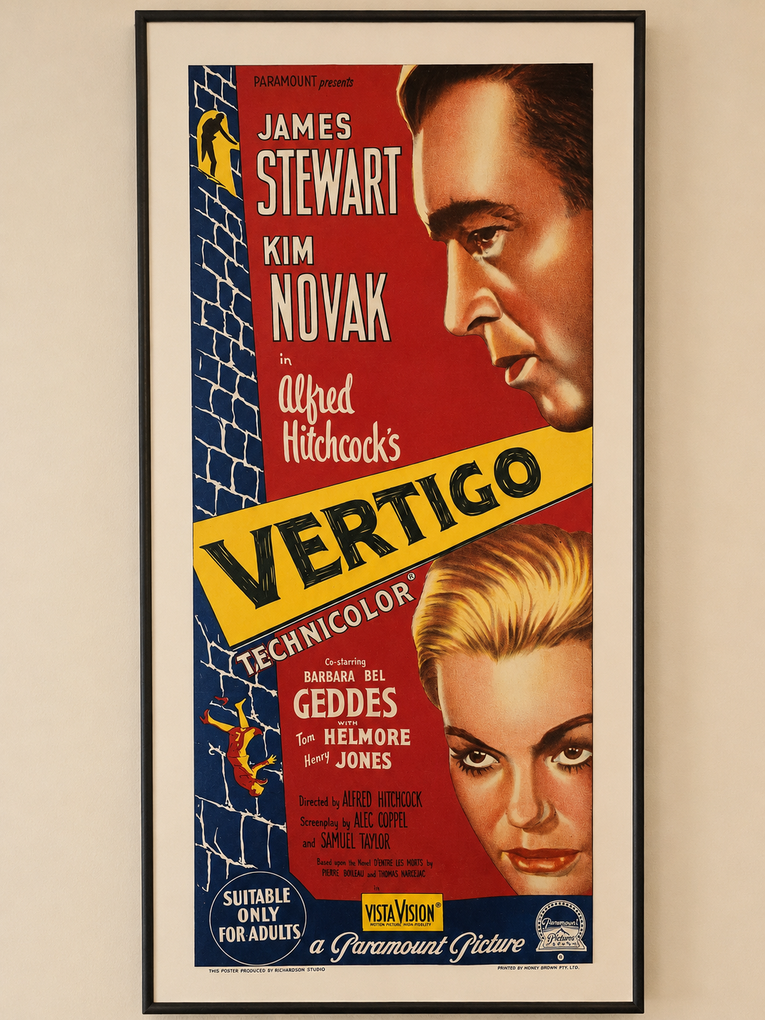
Australian daybills are especially well suited to residential display because their tall, narrow proportions fit naturally between doors, columns and other architectural features. The examples below are original Australian daybills from Alan Hutchinson's personal collection, displayed in his private home theater.
Beginning in the late 1980s, studios increasingly issued modern one-sheets in a double-sided format for illuminated theater lightboxes. These posters are commonly identified by collectors as DS, meaning double-sided. The standard modern U.S. theatrical one-sheet is generally 27 by 40 inches and is usually shipped rolled rather than folded.
A theatrical double-sided poster does not normally contain two different advertisements. The front carries the finished artwork, while the back carries the same composition printed as a precisely aligned mirror image in lighter tones. When viewed from behind, the title and artwork therefore appear backward.
The reverse printing is designed to work with light passing through the paper. In a back-lit display, the front and rear ink layers reinforce the image so colors remain saturated, dark areas retain contrast and the poster develops the luminous appearance associated with a commercial theater lobby. A single-sided poster can be placed in a lightbox, but it often looks pale or washed out because it was not printed for transmitted light.
Double-sided printing can be one useful authentication clue for a modern theatrical poster, but it is not absolute proof that a poster is original. Reproductions can also be printed on both sides, and studios continued to issue some legitimate single-sided posters after double-sided printing became common. Authentication should also consider dimensions, paper, printing quality, release information, provenance and comparison with known examples.
Posters and lobby cards became collectible partly because they were not intended to survive. Theaters folded, pinned, taped and displayed them, then returned or discarded them. The Library of Congress notes that lobby cards and posters were often supposed to be returned to distributors for later use or destroyed.
As television, repertory theaters, film societies and home video introduced older movies to new generations, the advertising art gained a second audience. Collectors began valuing posters as physical links to a film's original release. Museums and archives also recognized them as evidence of design, printing, celebrity culture and studio marketing.
A poster may be desirable because of the film, star, director, genre, artist, release date, country, format or visual design. Horror, science fiction, film noir, classic comedy, animation and major franchises have all developed strong collector followings.
One of the most famous examples of movie-poster collecting is Karoly Grosz's one-sheet for Universal's The Mummy from 1932. Grosz, Universal's advertising art director, combined a monumental image of Boris Karloff, the red-gowned Zita Johann, dramatic hand lettering and intense color in a stone-lithographed design created specifically for theatrical promotion.
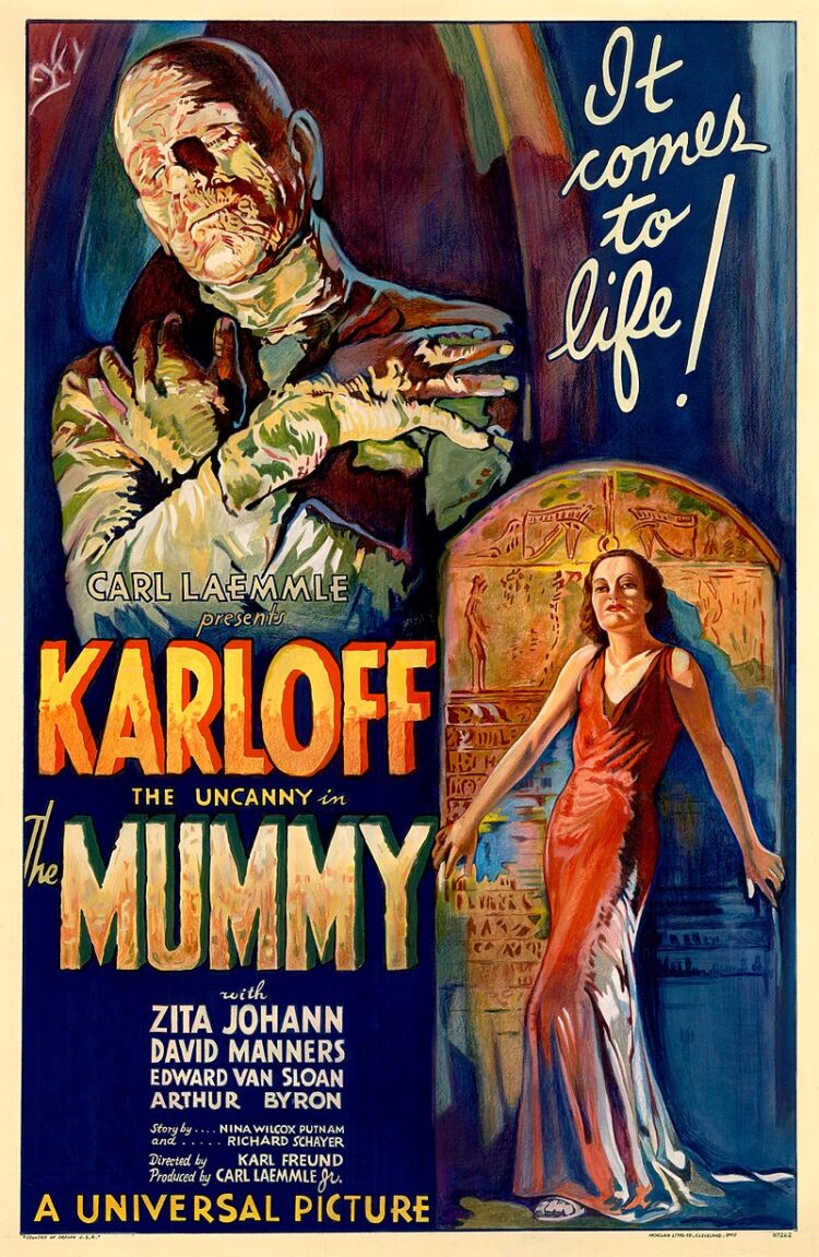
In 1997, an original example sold at Sotheby's for $453,500, establishing a world auction record for a single movie poster at that time. Sotheby's later described the design as one of only three known surviving examples. The 1997 record stood until it was surpassed by later poster sales.
The current widely documented auction record for an individual movie poster is $525,800, paid at Heritage Auctions in 2017 for a rare 1931 Style A one-sheet for Dracula. That distinction is important: The Mummy was the former record holder and remains one of the most valuable movie posters ever sold, but it is no longer the auction record holder.
The price reflects several forces that drive the high end of the market: an iconic film, a major star, exceptional artwork, a highly desirable horror subject, extreme scarcity, original theatrical use and a documented auction history. It also demonstrates how an object originally printed as temporary advertising can eventually be treated as a major work of commercial art.
The term “original movie poster” should be used carefully. It normally refers to advertising produced for theatrical distribution, but a film may have several legitimate original campaigns: advance posters, regular release posters, style variations, regional printings and international editions.
A reissue poster is also genuine theatrical advertising, but it was created for a later release. A commercial reproduction is printed for decoration or retail sale rather than for the film's theatrical campaign. Reproductions can be attractive and useful, but they should not be represented as original release material.
Authentication requires more than checking dimensions or finding an identification number. Paper, printing method, fold pattern, border information, distributor marks, known campaign variations and comparison with documented examples may all matter. Expensive or historically important items should be examined by a qualified specialist.
Many older posters were printed on relatively thin paper and shipped folded. Linen backing is a conservation and display process in which a poster is mounted to a supportive fabric backing, traditionally with reversible materials. It can flatten folds, stabilize tears and make a fragile poster safer to frame.
Restoration may include surface cleaning, tape or adhesive removal, tear repair, filling paper losses and carefully matching missing color. Good conservation attempts to stabilize the original and keep treatments reversible. Excessive repainting, trimming or irreversible mounting can reduce historical integrity even when the poster looks cosmetically improved.
The Library of Congress advises that preventive care—proper storage, environment and handling—is the most economical preservation strategy. It also recommends leaving minor damage alone when an item has collector value and does not require immediate treatment, rather than attempting an unqualified repair.
Paper is damaged by light, heat, moisture, unstable adhesives and poor handling. Original posters should be kept away from direct sunlight and intense display lighting. Storage should be cool, relatively dry, clean and stable.
Acid-free and lignin-free folders, mats and boxes can help protect paper. Oversized posters should be supported flat or stored using an appropriate archival rolling method. Pressure-sensitive tape, household glue, rubber cement and inexpensive adhesive mounting should not be applied to an original poster.
When framed, the poster should not touch ordinary acidic backing board. UV-filtering glazing reduces light exposure but does not make prolonged sunlight safe. Valuable or damaged posters should be evaluated by a paper conservator before cleaning, flattening or restoration.
Movie posters are no longer limited to commercial theaters. In many dedicated home theaters, media rooms and theater entrances, posters have become part of the overall design language. Homeowners often install framed one-sheets, reproductions or custom artwork in the lobby area, hallway or entrance leading into the theater room to create the same sense of anticipation once associated with a neighborhood cinema.
One of the most popular approaches is the use of back-lit marquee-style poster cases. These illuminated displays echo the lightboxes traditionally used in commercial theaters, where poster art was showcased in the lobby or near the box office. In a home setting, the same idea adds a strong architectural feature while helping the room feel like a true private cinema rather than just a television room.
For the most authentic result, a home-theater lightbox should be matched to the poster format and used with a double-sided theatrical poster intended for back lighting. Even, diffused backlighting helps avoid bright spots while bringing out the stronger color and depth created by the mirrored reverse printing. Valuable older single-sided posters are often better displayed in a conventional archival frame, since they were not designed for continuous light passing through the paper.
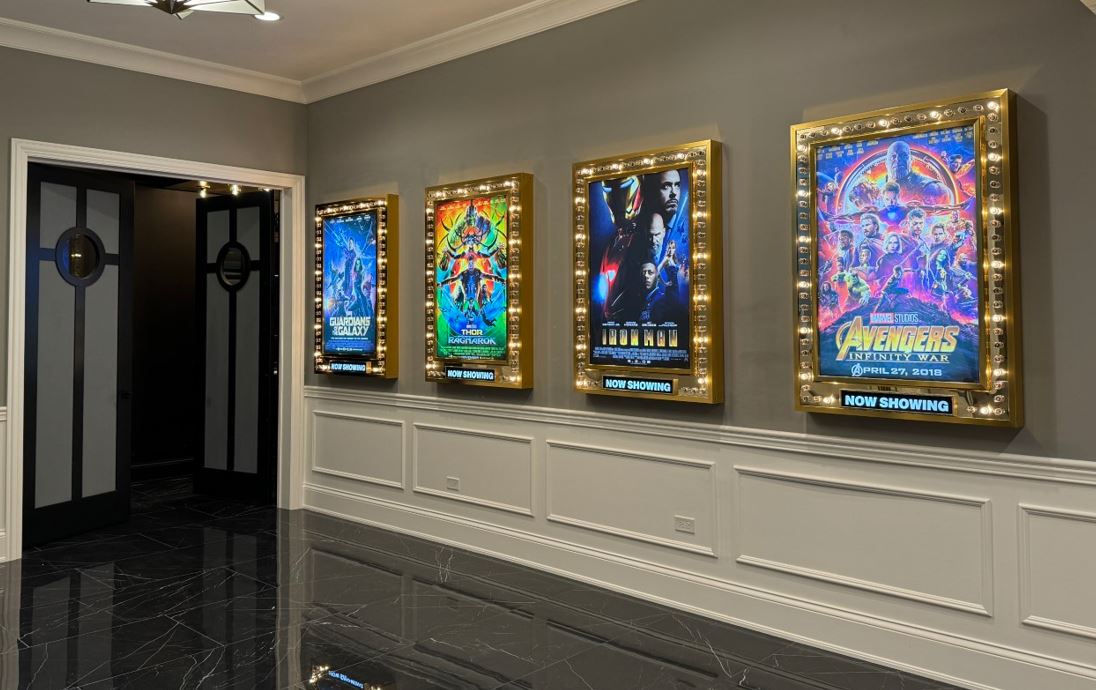
This trend also reflects a broader change in home theater design. As enthusiasts try to recreate the full theater experience, they do not stop at seating and projection. They add poster displays, marquee lighting, concession areas, themed carpeting and decorative wall treatments so the entrance and lobby become part of the entertainment. In that sense, the movie poster has returned to one of its oldest jobs: setting the mood before the feature even begins.
The movie poster has not disappeared, but its primary viewing environment has changed. A design may now appear first as a small image on a streaming service, mobile phone, ticketing application or social-media feed. This favors simple compositions, large faces, strong contrast and lettering that remains readable at thumbnail size.
Physical one-sheets still appear in theaters, and limited-edition screen prints have created a parallel market for artist-driven interpretations. These prints are different from original theatrical posters, but they demonstrate continuing interest in film advertising as graphic art.
The greatest posters do more than list a title and cast. They create the first visual memory of a movie. Long after the original engagement has ended, that image can remain inseparable from the film itself.

Alan Hutchinson is the founder and owner of HTmarket.com. He graduated from Babson College in 1984 with a minor in film and has worked in the home theater industry since 2000. His film interests include classic Hollywood, film noir, theater history and movie-poster collecting. His collection includes original Australian daybills for Alfred Hitchcock's Vertigo and The Birds.
Library of Congress: Motion Picture Poster Collection
Library of Congress: Early Motion-Picture Advertising
Library of Congress: Inside the Archival Box—Lobby Cards
Library of Congress: Inside the Archival Box—Press Books
Library of Congress: National Screen Service Poster Distribution
Art of the Movies: International Movie Poster Formats and Sizes
Museum of Western Film History: Movie Poster Formats and Double-Sided One-Sheets
Art of the Movies: Why Modern Movie Posters Are Double-Sided
Original Film Art: Italian Movie Poster Sizes
Library of Congress: Lobby Card Format and Use
Academy of Motion Picture Arts and Sciences: Poster Painters Collection
Museum of Modern Art: Batiste Madalena's Hand-Painted Film Posters
Academy of Motion Picture Arts and Sciences: Saul Bass Collection
Museum of Modern Art: Saul Bass, The Man with the Golden Arm
Smithsonian National Postal Museum: Drew Struzan Biography
Academy Collection: Richard Amsel Papers
Smithsonian Institution: Archives Center Poster Collection
Sotheby's: Karoly Grosz's 1932 The Mummy One-Sheet
Heritage Auctions: 1931 Dracula Poster Auction Record
Library of Congress: Care, Handling and Storage of Works on Paper




